So as I had mentioned, I’m bringing back the BtS Comic Cover Critique (might have called it something else ages ago) and here it is. What is it, you ask? I show 3 comicbook covers and critique them as The Good, the Gah and The Fugly with some honorable mentions. Check it out, I might be talking about your favorite comicbook!
Outlined are MY comicbook cover rules / criteria I’m using to critique a comicbook.
- Needs to be eye catching!
- Should show some action, situation or drama related to the story inside.
- Should NOT be any of the billion heroic poses of the main character(s) or villian(s).
- NO close-ups of villain(s) faces. No one cares.
- Insight. Let the buyer know WHAT is happening in that comic.
- Needs to be more than the Title / Logo. ie. It’s NOT just the Batman symbol.
- Do NOT keep changing the Title / Logo!
Comic Cover Critique for the week of March 9th, 2016
The GOOD

Doctor Strange (2015-) #6
This cover is stunning, it’s eye catching and a touch of Pop Art in the “standing there” pose with the evil branches growing out of Dr. Strange and the burning mansion as his head. I’m not the only one who loved it, so did current Dr. Strange movie director Scott Derrickson on his Twitter account, see below (yes, I’m name dropping, suck it!):
Terrific cover for the latest #DoctorStrange comic: pic.twitter.com/PFmLWmHCvN
— Scott Derrickson (@scottderrickson) February 11, 2016
Honorable Mentions:

Kennel Block Blues #2 by BOOM! Studios – Just look at that eye catching cover, it’s a scene around the blueprints of the escaping building. Almost was THE GOOD issue. Love this cover.

Gutter Magic #3 by IDW – This cover captures an action scene, yes in heroic poses but I give that a pass as it actually shows something happening. Drama!

Ms. Marvel (2015-) #5 by Marvel Comics – Riff’ing off true Pop Art style & fashion of mocking of the multi hero poses works.

Adventure Time #50 by BOOM! Studios – Mixing up that Pop Art style & clean Title / Logo works.

The Massive: Ninth Wave #4 by Dark Horse – What a great scene for a cover & the Title / Logo is eye stunningly good.

The Hangman #3 by Dark Circle Comics – I mean Wow, just creepy as fnck and eye catching enough that I’d definitely browse through this issue and maybe just buy it for the cover alone.
The GAH

Detective Comics (2011-) #50 by DC Comics
Holy SNIPES! Remember when I said “no heroic poses” & “Needs to be more than the Title / Logo”, this issue does BOTH and gives me NO clue as to the story. Is it about Batman (Bruce or Gordon) lost in his own Batcave & he’s SO fncking bored that he needs to make his Bat symbol of HUMAN BONES on the floor then LOOK UP at… a BatCam and ask Alfred to take the selfie?! WHAT THE FnCK?! I read issue 49 and it made NO Fnkcing sense & then I see this cover and it WOULDN’T Ever make me pick up the comicbook and buy it. I’d be like #YeahBuWha!?
Honorable Gah Mentions:

All-New Wolverine (2015-) #6 by Marvel Comics – Remember what I said about Heroic poses. That is ALL this cover is about, other than showing the main characters, you have NO idea what this bloody story is about and NO reason to pick it up other than the cover telling you it’s the “Startling Conclusion to…”, yeah thanks but NOPE.
The FUGLY

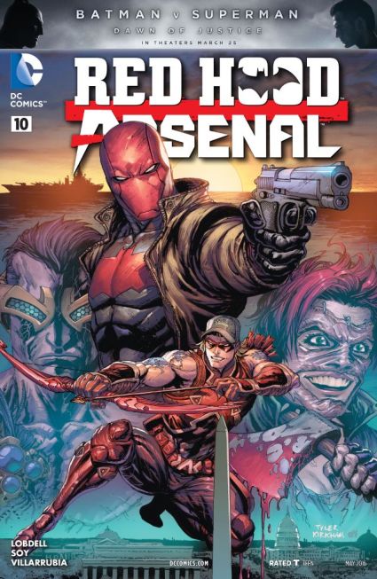
Red Hood/Arsenal (2015-) #10 by DC Comics – Remember when I said NO bloody heroic poses and close-ups of villain faces? Here’s it’s BOTH so all I can assume is that they fight or are doing a Zoolander Fashion Show Walk OFF?! Just fnck NO.
Honorable Fugly Mentions:

Transformers: More Than Meets the Eye (2011-) #50 – It’s ALL heroic poses & villain close-up face shots. Sure it’s very clean artwork but looks more like a poster that is just generally about Transformers than any single issue. Thank the forgotten gawds the cover is pretty because it tells NO story. If people pick this up it’s because of the poster concept pavlov’s dog-like response.
So that’s it for this week and before you say “Hey Robert, you ass! You’re biased to Marvel Comics and specifically to Dr. Strange!” and to that I say…
Until next week, later spambots! Yes, I can be a fncking ass. Deal.


You must be logged in to post a comment.